Color and Typography
Color Usage
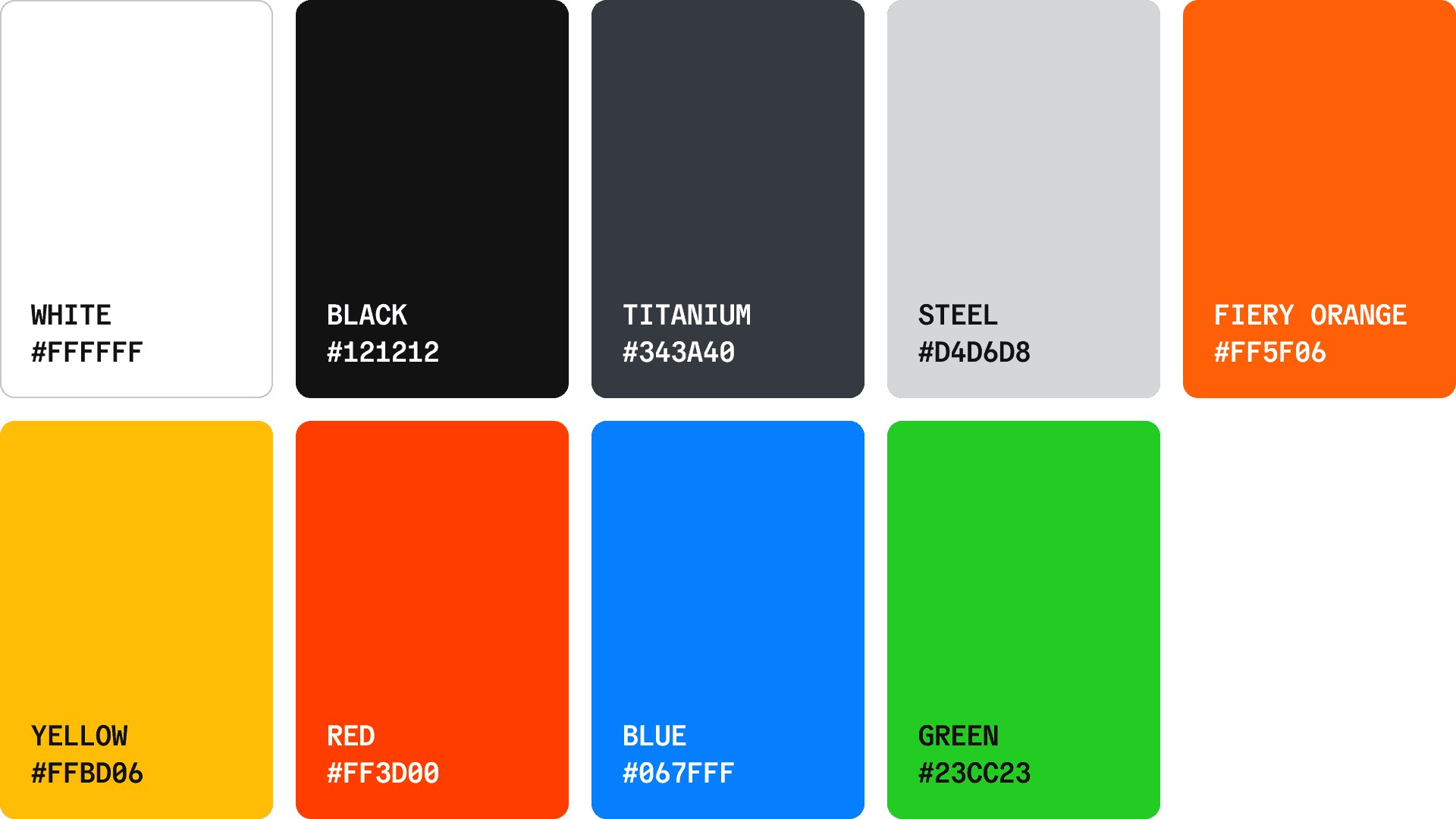
A refined palette blending modern luxury with subtle power. Primary tones convey resilience and clarity, while Fiery Orange adds intentional energy and brand distinction.
Color Palette
Our color palette is designed to be both balanced and surprisingly dynamic. Our black and white bring a sleek sensibilty while the rest of our palette brings lively expression.

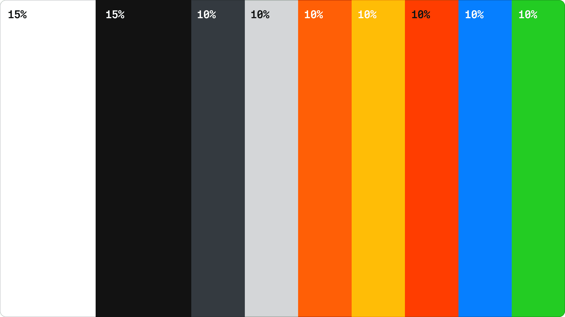
Proportion
The balance of color is important to maintain a cohesive identity. When using the palette in any context, reference the proportion of colors below.
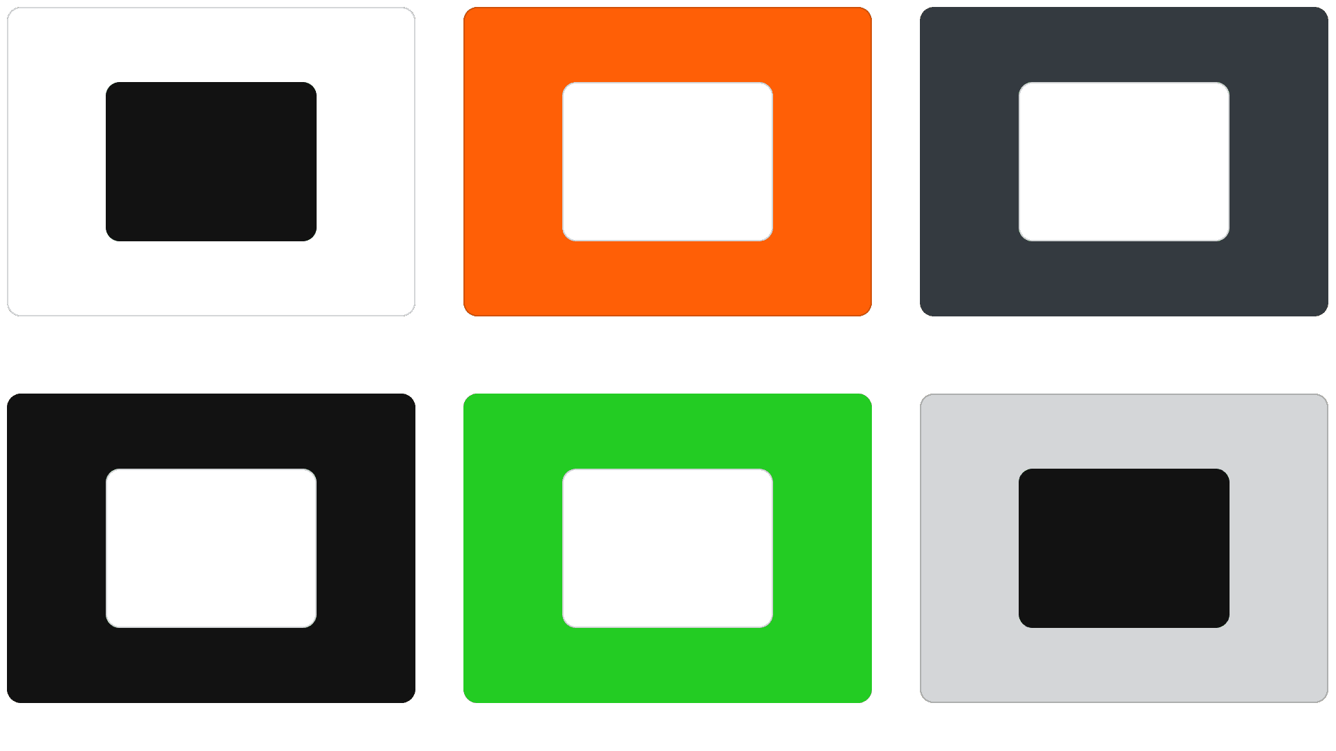
Combination
The following diagram demonstrates approved color combinations for all use cases. These color combinations pass WCAG Contrast standards at the AA level.
Don'ts
Do not diminish the value of color in our brand. Avoid the following treatments.